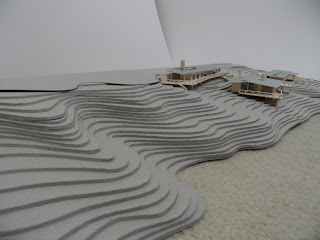
For this semester, the requirement is to design a library and an amphitheater within a space of Matraville City.
The area consists of many historical buildings with the back of the RSL building facing the site. The analysis of the site allowed a further understanding of how the building is located within the designated site.
Mapping
The mapping diagrams that have influenced the making of the design. The top left diagram shows the possible routes of access to the site. It includes walking distances, transportation and alternate routes to the site.
The second map outlines the negative spaces of the context. It shows an understanding of how dissipated the surrounding buildings are. Ultimately indicates the desired views for the reading space.
The large map on the right is of the proposed design. It contributes to the context and themes that have been explored. The map shows the usage of the buildings where dark grey illustrates commercial usage with the lighter grey residential.
As a result, the studies allows an understanding of who the main users are.
Planning
Diagrams explaining the design in relation to the mappings. (1) The negative space on the site used as landscaping (2) A diagram of an access route from one end to the other (3) The structural form of the design where each type of structure consists of a specific function.
The main building on ground floor occupy services that consists of noise such as the information desk, cafe and computer rooms. Externally there is another cafe for the general public. There is its own sitting space and the amphitheater excavated into the ground and a children's play area defined by the landscape trees.
On the first floor there is the office located above the entry and void. The floor also consists of an audio room, a small indigenous library and a children's library.
Up towards the second floor, there consist of the main library and reading space which looks beyond the landscape through the RSL greenery.
Sections and Elevations
There are four sections to which each tells a different story.
(1) Section is cutting through the cafe facing East.
(2) Same section but cut more towards the East end.
(3) The section have been cut through the center of the site through the amphitheater facing North. There is the floating box which is supported by columns and how this character is then translated along the site by the use of the trees.
(4) Again, taken at the same place as the previous but taken back into the main building. The section shows how the transition of the increase in levels is connected.
Elevation 1 - The back of the site at East. Indicating the materiality of the floating box and how it angles towards the landscape.
Elevation 2- Further indicating how the three elements connects to one another.
Selected Room - Materiality of main reading area
Cross Section
A perspective cross section of the main reading area and how it connects to its surrounding functions.
Section Reading - Materiality of main reading space.
Sketch perspectives of most interesting space - The void of the entry space.
Due to the high void, this space can view all three levels of the building and its relationship externally. The two perspectives of the window looking out into the courtyard can be viewed from the same entry space. The window looking out into the courtyard also occupies a sitting space for parents to monitor their children out in the play area located directly on the opposite side of the window.
Three dimensional renderings
Physical model


